Now I don't purport to be a marketing expert, but as someone who has taken exactly two of the same marketing class in college, I know a thing or two about branding. One thing I have that others don't? A little real world perspective. I know what people want, because I live and breathe in their shoes. So let me redesign your logo for you.

What's even going on here? We got a mermaid lady in the center of a green circle. What about this makes me hungry for a nice cup of joe? I don't feel the richness, flavor, nothing. This could be the logo for a swimwear company for all I know! Not to mention the only "stars" here in STARbucks are small and easy to miss. Now here's my take:

It may seem obvious in hindsight, but check out those rich coffee flavors bursting out! You gotta think about the PRODUCT you are offering people when designing logos, and that's exactly what I've done, in addition to creating memorable iconography with the titular star. You'll note that I've also added a much needed ENERGY to this branding, subtly inserting the notion that this coffee will give you the pep you need to start your day. The lesson? Synthesize your product with your brand and you'll create something with immediate messaging clarity.

Yikes, could ya get more lazy? My newborn nephew could have made this. Four colored squares, what is this meant to communicate? They're static, lifeless, and have nothing to do with Microsoft's brand of building extremely small computers. Let me show you how it's done, Mr. Gates:

Instantly iconic. Not to toot my own horn, but notice how I've subtly incorporated Microsoft's name and product into one simple piece of branding imagery. Microsoft's patented small computers, highlighted by an "O" that is also a magnifying glass! I've also elected for a font that has much more character, styled after the roarin' 20's, to sell a Gatsby-like class to these top-of-the-line machines.

For a delivery company named after a rainforest, this sure feels adventurous huh? That was sarcasm, by the way. What a missed opportunity! Instead of rolling through jungles, cutting through vines to get your packages, this word logo just says "we deliver and you'll be pleased I guess." Earth to marketing people: putting a smile on something doesn't automatically make me happy! This is the joker of brand logos. Let's see what we can do to fix it:

Now THAT'S a delivery company. Come hell or high alligators, these packages will be delivered with a patented Indiana Jones fervor. AMAZON is now emblazoned in a boot camp stamp, as if to say "your packages are as important to us as war supplies." Customer service, name and brand synergy, it's all here. This is a logo that can punctuate the end of your commercials with a distinct slam, accompanied by the sound of bongo drums.

Pepsi seems to have found themselves in a branding rut, with this being one of three recent re-brandings they've done in the past decade. To me, this reeks of uncertainty and desperation. When your brand has had all identity simmered away over the years, in trying to please every market, leaving you with an expressionless ball of your team colors. Pepsi, I know exactly what it is you need.
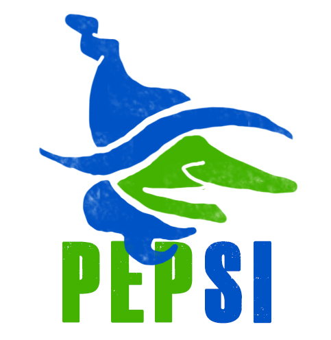
The first thing any company should do when it finds itself having a branding crisis is to step back and examine their target audience. I did some market research myself in preparing this design, and from my observations of my neighbors' open windows, Pepsi's audience seems to skew heavily towards women. So what imagery resonates with women? Witches. Well hocus pocus, and abra ka zoom! I've brewed up the kind of sleek yet edgy new brand identity that this failing cola company seems to so desperately need. Finally, you'll note that I've also added an extra color-coded message to subtly insert the notion that this cola will give you the pep you need to start your day.
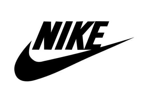
Uhh, check please! Or should I say, no check, please! What is a check mark meant to convey here? Good job, you bought the right shoes? Swoopity doop, you've got the scoop? There's so little information conveyed here, it's amazing to me this made it to print. And no Nike, italics don't emphasize your logo like you think it does.

This took a lot of work, but I boiled down Nike's brand to two important things: SPEED and SHOES. When you wear these shoes, you should feel powerful, like The Flash. You'll note the red coloring brings up additional imagery of strong, athletic characters like Superman, Spiderman, and The Flash. This creates mental associations with your brand in the prospective buyer's head. The illusion of movement is a powerful visual tool, and one that seemed to me most fitting for athletic shoes.

At first glance, this logo does a fairly decent job at communicating to the viewer some of the fast food giants' best known qualities. The two giant french fries dipped into a pool of ketchup is a powerful image, and one that brings to mind many fond memories. However, I think the biggest problem with this logo is that it's too limiting. Surely McDonalds as a brand has grown beyond its humble fry-dipping beginnings, and that should be reflected in a modern logo.

I thought to myself, "what unites the expansive McDonald's menu?" After much brainstorming, I came to a simple, yet iconic conclusion. KETCHUP. Ah yes, the patented McDonald's ketchup packet, an elegant piece of imagery that brings to mind all manner of memorable McFoods. Burgers, Fries, Chicken Nuggets, you name it, that little plastic tube has been there for you. This logo encompasses that iconography and fuses it into the very name itself, creating a much more expansive vision of what modern McDonald's has on offer.

Facebook's logo is as simple as they come. It's the name. Like, seriously that's it. When forced to shorten the imagery for apps, they settle on a lowercase F. I couldn't think of anything lazier if I tried! Now, I know word logos are every bit as important as iconography, but we can surely do better than this, Mr. Zuckerburg.
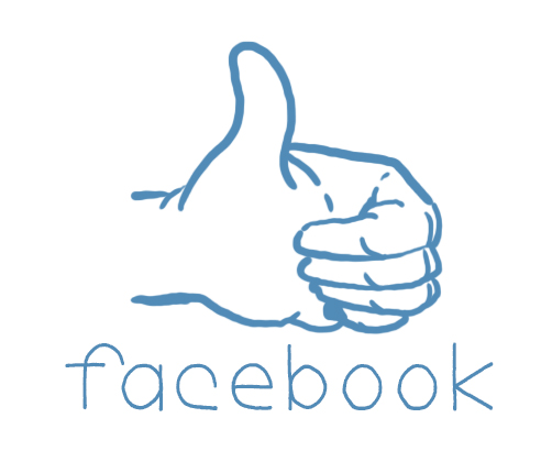
For my version, I tapped into what makes the Facebook brand a household name: it's human. We reach our human friends, human relatives, and human brands through this little website every. Single. Day. And that kind of humanity is exactly what I set out to reflect with my rebranding. FACEBOOK is now made up of several thin, handwritten letters that constantly wiggle. Imperfection. To err is to be human. And above them, a human hand, the new icon of facebook, also constantly wiggling. This rebranding should always be displayed over white wooden textures, and maybe painted pinecones, to further ground them in human reality.

Another simple word logo, albeit this one at least tries to have some personality. The way "NetFlix" curves across the screen like a distorted film projection does indeed bring to mind Hollywood Blockbusters. But the frightening red makes me think of horror, ketchup, or The Flash, which feels limiting for an internet service that supposedly provides a wider entertainment experience. Not to mention that NetFlix's main selling point over other entertainment providers (its online accessibility) gets lost in the visual shuffle entirely.
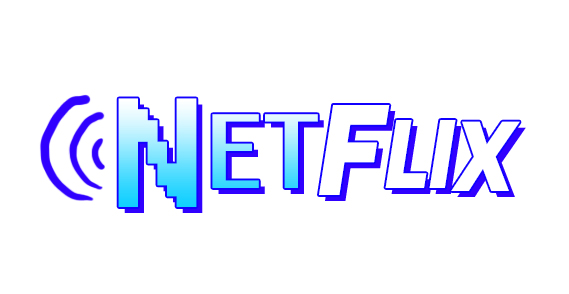
It's important to distinguish yourselves from your competitors, so in my rebranding you can see I have elected to emphasize NetFlix as an online experience. Additionally, the sky blue gradient in "Net" brings to mind both the digital and real worlds, unifying them as one, while "Flix" opts into that classic Hollywood signage white. The experiences one might have with the service are widened, while the online advantages are clarified. Simple fixes, but effective!

I understand that some logos have a legacy to them, but when your multi-billion dollar company still uses its founders' scribbled signature as their worldwide logo 50+ years after he died, that's a big red flag for me. So much has changed over those decades, and trends change! Children (Disney's main demographic, mind you) just don't enjoy cursive the way they used to, and the lettering doesn't even read the same way. Do you know how many times I hear kids mispronounce this logo as "Gisney?" I haven't personally heard this happen in my presence but I assume it happens way too much.

To find out what resonates with modern children, I took a deep dive into researching kids' entertainment and came to a few conclusions, all visually represented in my rebranding. First, kids love big letters that knock into each other, making wood block sound effects when they do so. Second, kids love when those big letters bounce up and down constantly, like they're made of rubber, even though that conflicts with the wood block sounds they made earlier. Third, kids love saturated colors, and things that wildly vary in size and shape. While bold, this new logo is near-guaranteed to strongly resonate with Disney's target demo, so long as it's always introduced by rushing into frame, stopping short with exaggerated car skidding sounds.
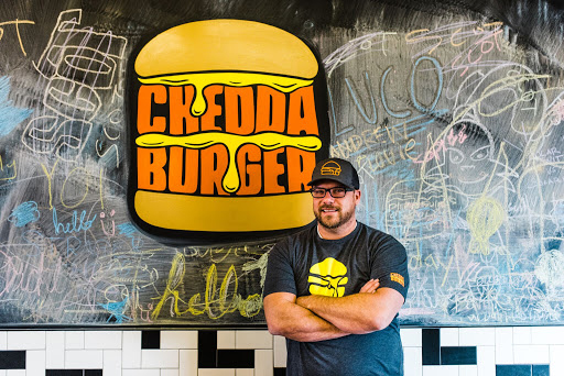
I have nothing to add here. You can't argue with perfection. Cheddaburger nailed it out of the gate; a flawless example of logo design.
–
This Week on Something Awful...

Pardon Our Dust
Something Awful is in the process of changing hands to a new owner. In the meantime we're pausing all updates and halting production on our propaganda comic partnership with Northrop Grumman.

DEAR FURRIES: WE WERE WRONG
Dear god this was an embarrassment to not only this site, but to all mankind

Let's improve landmarks
Landmarks and statues around the world: old, boring and could use an update.

Make Horror Wholesome
Join the SA Forum photoshop goons in their quest to make horror wholesome!

Every Conceivable Way EA Could Screw Up Star Wars: Squadrons
Yes, there are finally enough games for a new round of One Sentence Reviews
About This Column
Featured articles and columns that don't fit anywhere else on Something Awful.
Previous Articles
- Y’all Engineers Can’t Pimp My Meme Swag
- WTF Am I Quarantining About
- I Stopped My Childhood Bully with Just Two Words (and I Came to Regret It)
- I Have No Chill And I Must Scream
- Designing Your Zen Kitchen
Suggested Articles
- The Dark Knight Rises; A Batman Retrospective
- Denny's Tumblr
- Cold Light of Day; Resident Evil: Retribution; The Odd Life of Timothy Green; Arbitrage; Berberian Sound Sudio; Anna Karenina
- Dredd; The Words; [REC]³ Génesis; Robot & Frank; Branded; The Oogieloves in the Big Balloon Adventure
- Monster Monsters